Drinking & Driving Infographics
Two data visualization infographics designed for distinct audiences, demonstrating how design choices, from chart types to color schemes, can be strategically tailored to meet different audience needs and communication goals.
Expert Audience
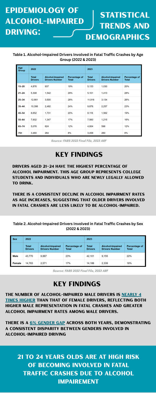
Researchers & ProfessionalsA data-focused infographic designed for researchers who need straightforward information to identify trends and create preventative programs aimed at reducing drinking and driving incidents.
Design Choices
- Tables for direct data presentation
- Professional, elevated language
- Neutral color palette for objectivity
- Comprehensive statistical information
- Source citations for credibility
- Emphasis on raw numbers and percentages
College Students
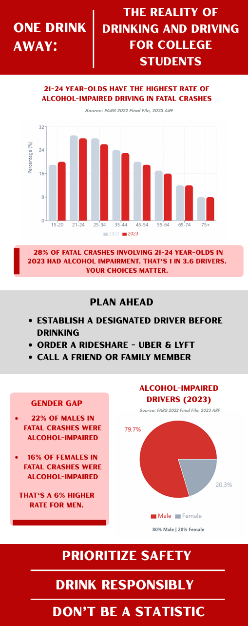
Non-Expert AudienceA persuasive, safety-focused infographic designed for college students, using visual rhetoric and emotional appeal to create urgency around drinking and driving prevention.
Design Choices
- Red color scheme for urgency and warning
- Simple, scannable chart designs
- Conversational, personal language
- Shorter chart titles for quick reading
- Actionable safety tips included
- Emotional phrases: "Don't Be a Statistic"
Design Process
For this project, I developed two infographic documents demonstrating drinking and driving trends, each tailored to a different audience: researchers and college students. The challenge was to present the same data in ways that would resonate with each group's specific needs and communication preferences.
Researchers required more straightforward information while college students required a digestible persuasive angle towards their safety when drinking. My approach involved strategic decisions about chart types, visual encodings, hierarchy, typography, and color choice—all personalized specifically for each audience.
Design Strategy
Expert Audience Strategy
- Chart Type: Tables to let "data take center stage" (Knaflic, 2015)
- Purpose: Enable researchers to identify trends and create preventative programs
- Approach: Numbers are more impactful than persuasion for data collection
- Color: Relaxed palette to balance the elevated language and dense information
- Language: Strategic use of professional terminology
Student Audience Strategy
- Chart Type: Simple, scannable graphs for quick comprehension
- Purpose: Appeal to fear factor, persuasion, and safety concerns
- Approach: Assumption that audience skims or prefers less text
- Color: Red creates sense of urgency and immediate worry
- Language: Conversational with emotional impact ("one drink away," "don't be a statistic")
Key Findings Presented
- Age Risk: 21-24 year-olds have the highest percentage of alcohol impairment in fatal crashes (28% in 2023)
- Gender Gap: Male drivers are nearly 4 times more likely to be alcohol-impaired in fatal crashes than female drivers
- Consistent Disparity: 6% gender gap persists across both 2022 and 2023
- Age Correlation: Alcohol impairment rates decline as age increases
Visual Rhetoric
The pie chart in the student-focused infographic used visual rhetoric intentionally. The red color encompasses the majority of the chart, creating immediate concern for readers, particularly among the male demographic. This design choice transforms statistical data into an emotional experience, making the numbers feel personal and urgent.
Both documents utilize the same typography fonts for universal readability and monochromatic color palettes for cohesiveness, while differing in many other design principles to prioritize their respective audience needs. All charts, graphs, and tables reference the FARS (Fatality Analysis Reporting System) source, making the infographics more reputable and giving audiences the opportunity for fact-checking or further research.
Skills & Tools Used
References
Nussbaumer Knaflic, C. (2015). Storytelling with data: A Data Visualization Guide for Business Professionals. John Wiley & Sons.
Yau, N. (2018). 7 basic rules for making charts and Graphs. Retrieved from https://flowingdata.com/2010/07/22/7-basic-rules-for-making-charts-and-graphs/
Data Source: FARS 2022 Final File, 2023 ARF (Fatality Analysis Reporting System)